Hullstone
The ReBrand
It’s about the emotional connection people build with a brand over time. For Hullstone, that meant creating an identity that felt grounded, trustworthy, and distinct, while signaling modern capability and long-term vision.
How it All Started
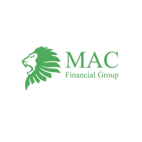
Prior to rebrand, the company (known as MAC Financial Group) was founded to support small businesses with their bookkeeping and compliance needs. Understandably, most founders are focused on building their products and growing their companies—so MAC set out to become the backbone of their back-office operations. From monthly reconciliations to checks and balances to broader financial strategy, MAC kept the proverbial train on the tracks.
In the early days, their client base was primarily made up of businesses in the construction and restaurant industries. But as their clients’ needs evolved, so did MAC. Over time, the team developed new tools to better serve their customers and began identifying opportunities in additional markets. It was at this point they realized the company had outgrown its original identity—and that a rebrand was in order.
The Elephant in the Room
As the company evolved, it became clear that the original name no longer reflected what the business had grown into. For starters, there’s the small matter of another company called Apple that happens to have a product named “Mac.” While the overlap wasn’t intentional, it certainly didn’t help with differentiation.
Evolution Was in Order
Even the descriptor “Financial Group” no longer told the full story. What began as bookkeeping and compliance support had grown into something far more comprehensive—spanning financial operations, strategic guidance, and purpose-built tools designed to help businesses run more effectively. The brand, however, still suggested something narrower and more traditional than what the company actually delivered.
Early Driver
The name itself was originally derived from the founder’s initials—a perfectly reasonable choice in the early days when the company was small and personal. Likewise, the lion in the logo was a nod to his Zodiac sign, a symbolic touch that made sense at the time. But as the company matured, these personal references began to feel less aligned with the broader vision of the business.
Acceptance & Realization
At that point, it was clear the business had outgrown its original identity. A new name and brand would be needed—one that better captured the scope of the work, the value delivered to clients, and the direction the company was headed.
The Strategic Foundation
Clarity in positioning
Consistency across channels
Stronger trust with the right audience
Scalable Brand Governance
RENAMING
Must meet the following criteria; Easy to verbalize, Short Syllables, Memorable.
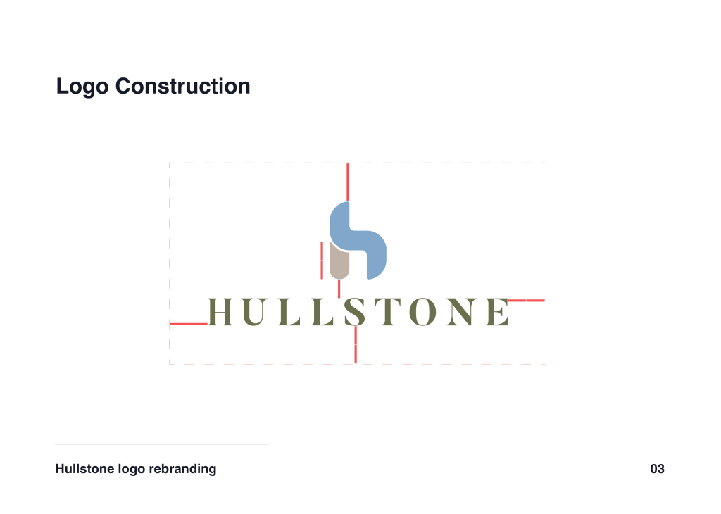
We explored hundreds of names, drawing inspiration from Latin root words, the origins of bookkeeping from the Egyptian civilizations, and word associations to ‘money’. We kept coming back to the theme of ‘direction’ and the idea of the North Star providing guidance. This nautical element eventually brought us to the hull of a ship, which is the watertight protective barrier that keeps cargo safe. But we also wanted to be the rock, and stable foundation for every small business. Thus, HULLSTONE was born!
Positioning
Comprehensive Bookkeeping & Strategy for Small Business


Balancing Elegance & Authority
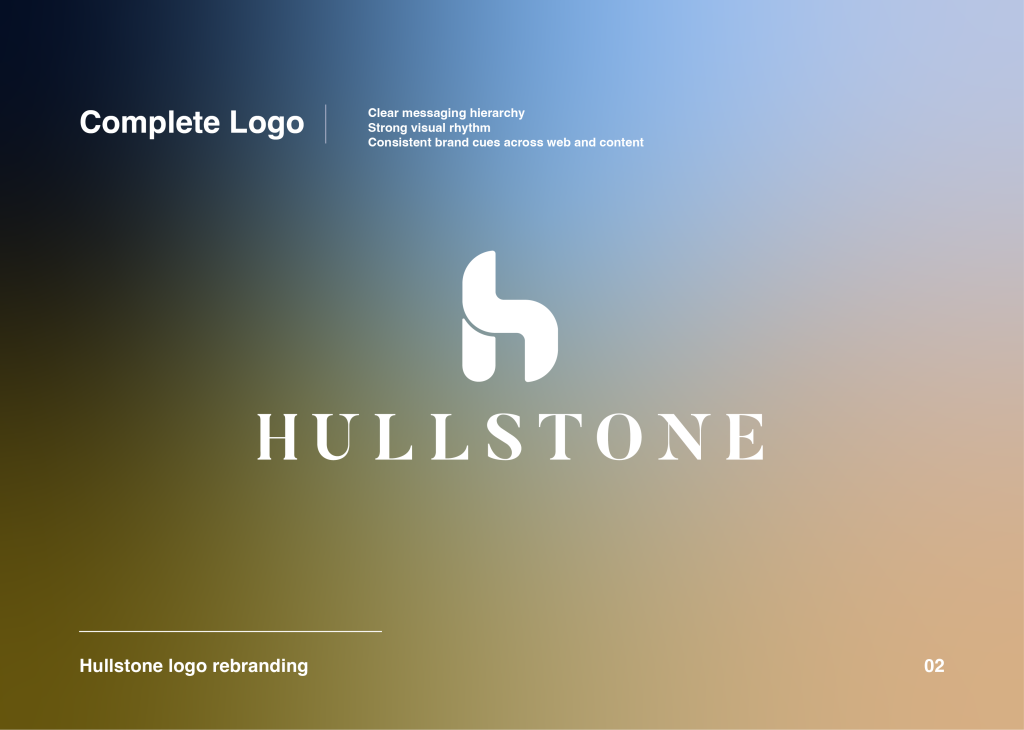
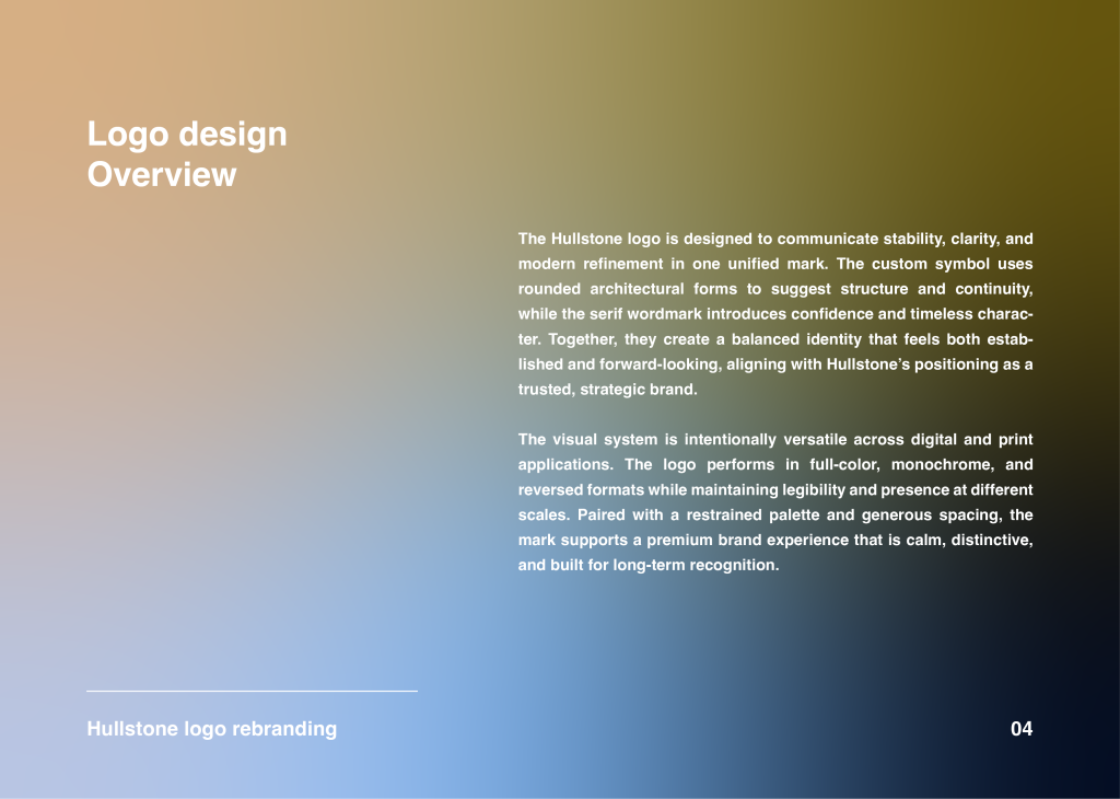
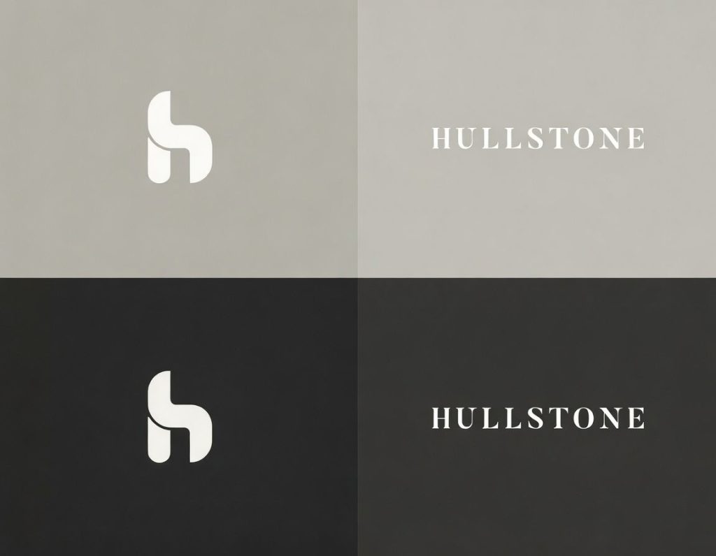
A refined logotype for instant recognition
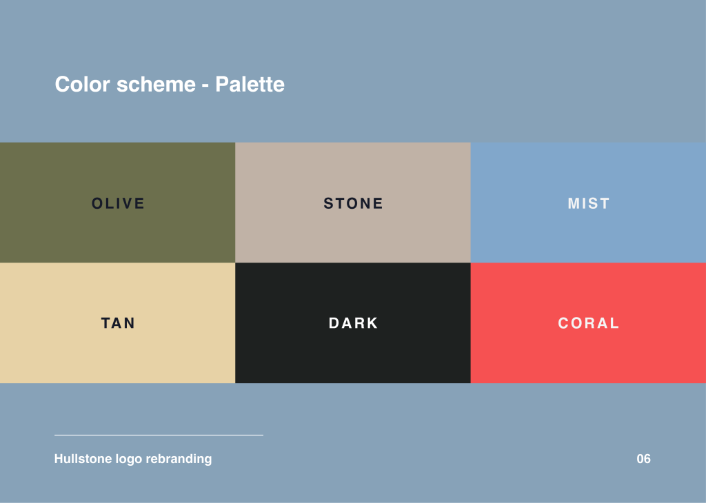
A restrained color palette for confidence and focus
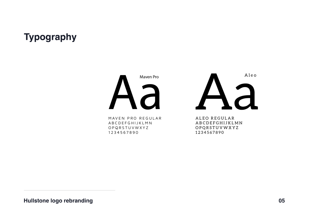
Typography that is clean, modern, and highly legible
Together, these elements create a cohesive identity that works across digital, presentation, and brand collateral.